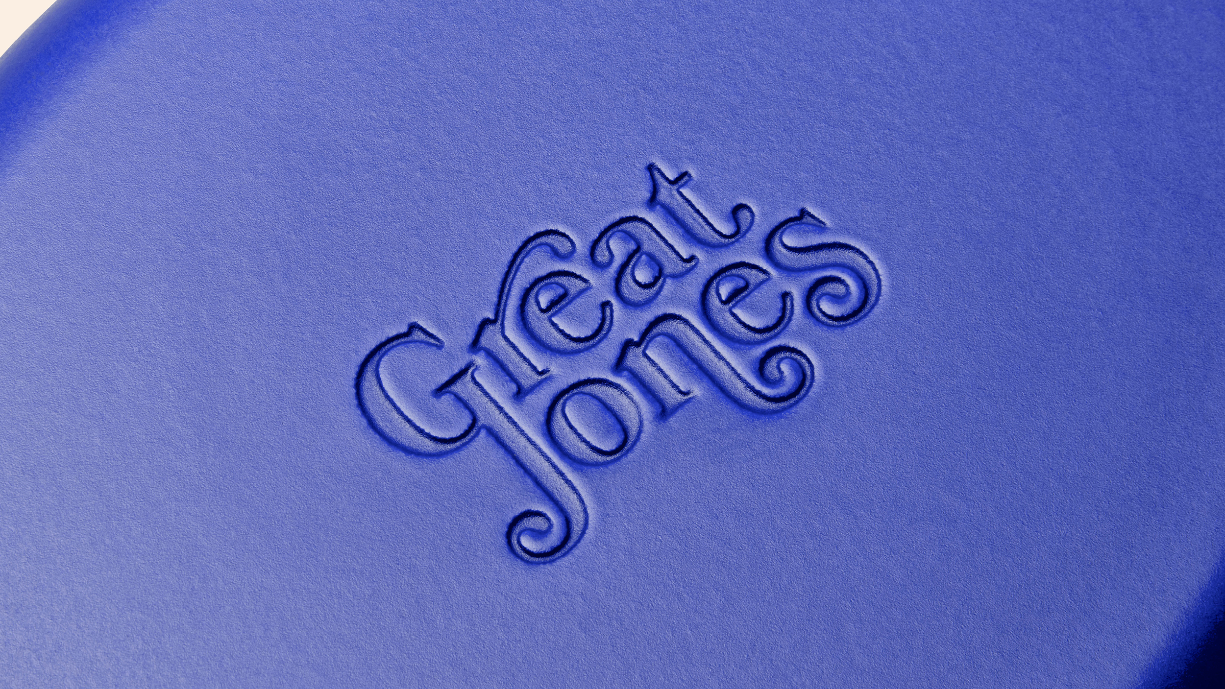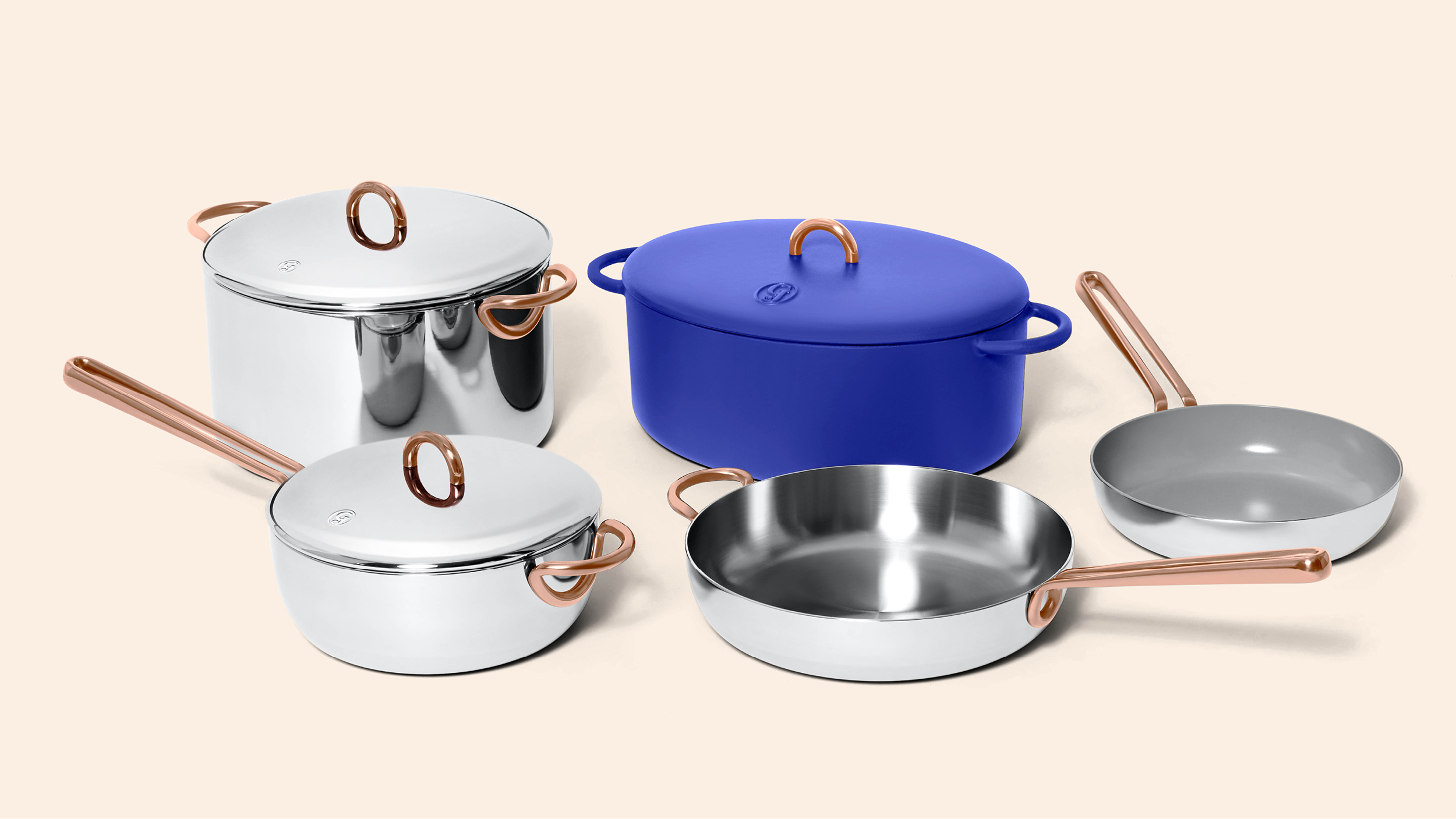
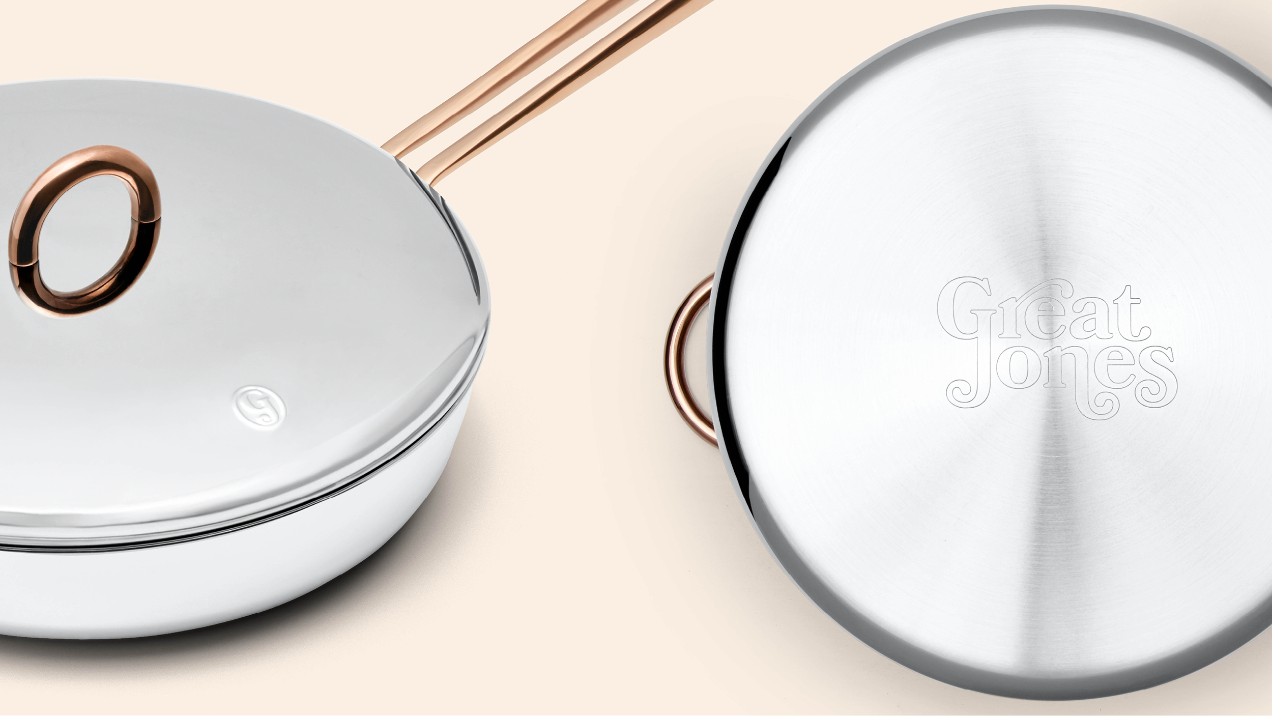
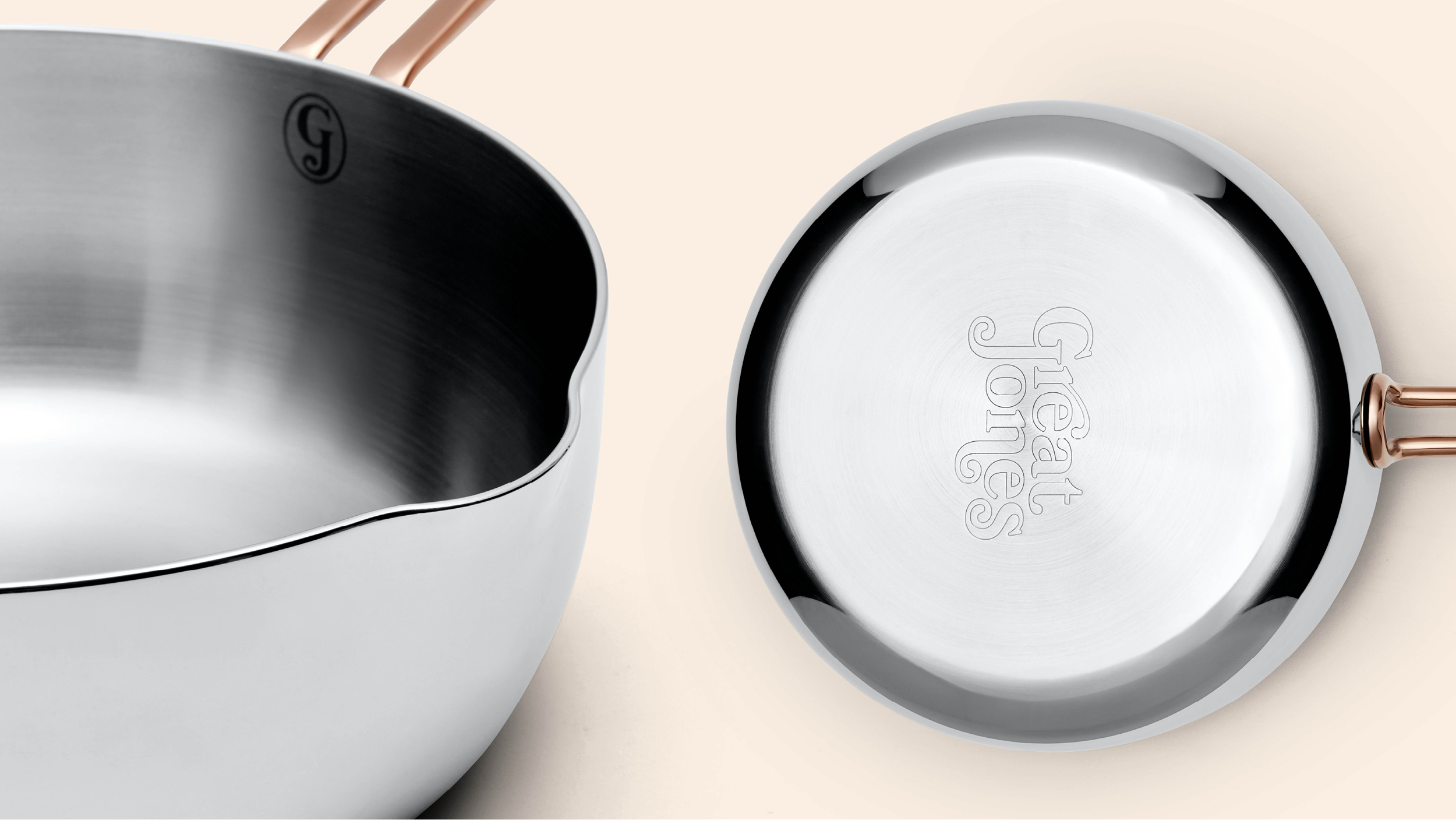

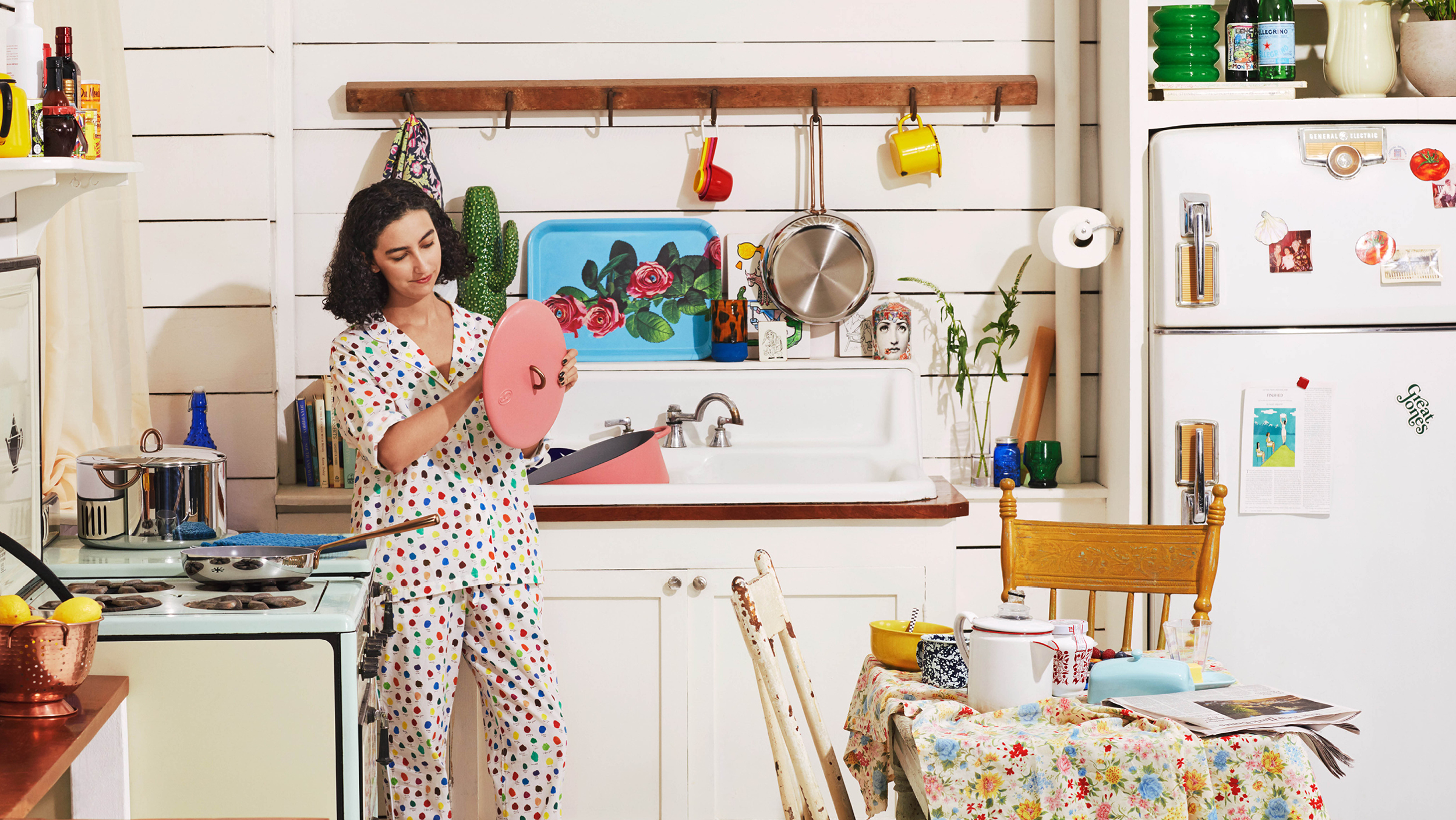
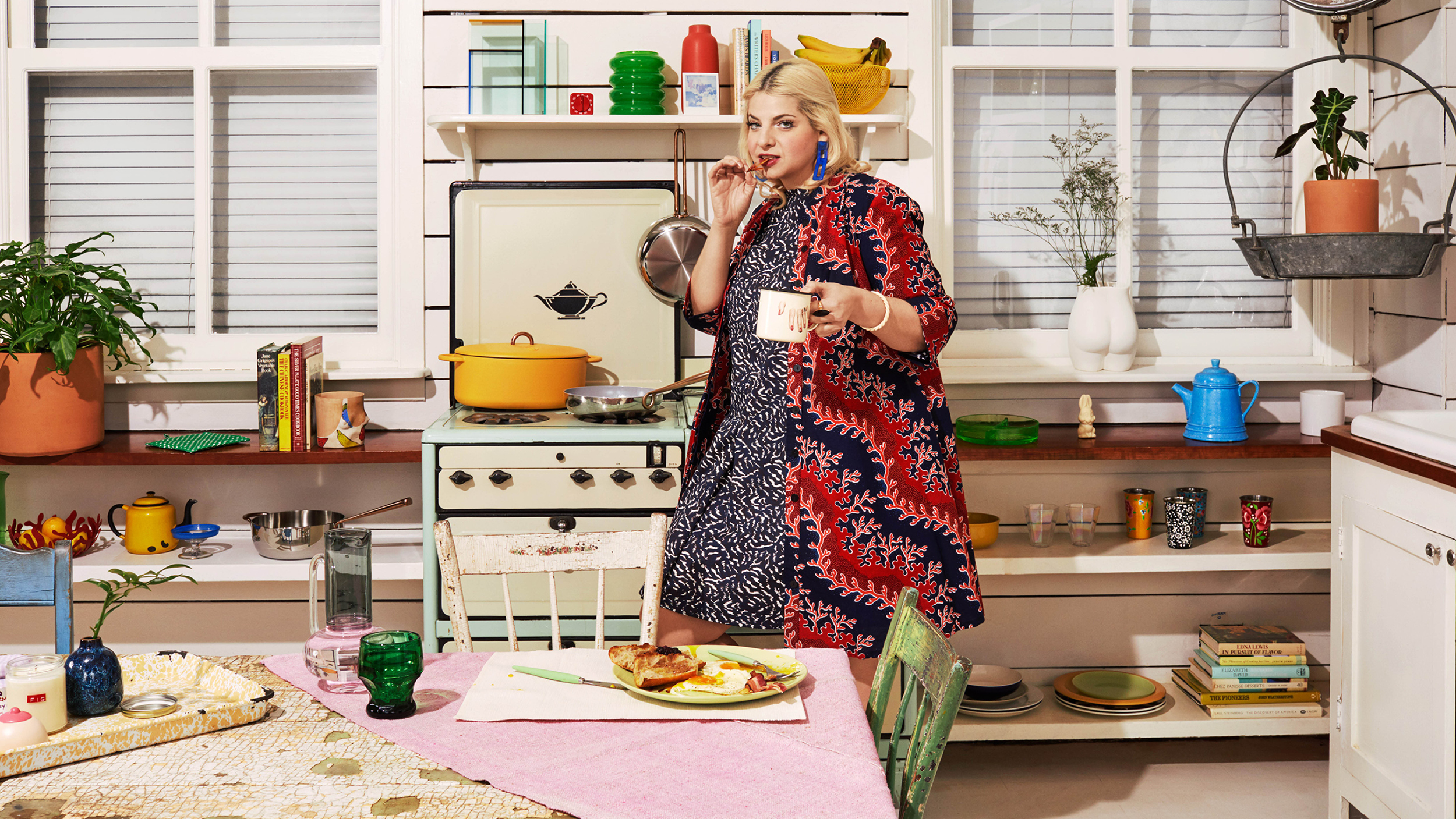
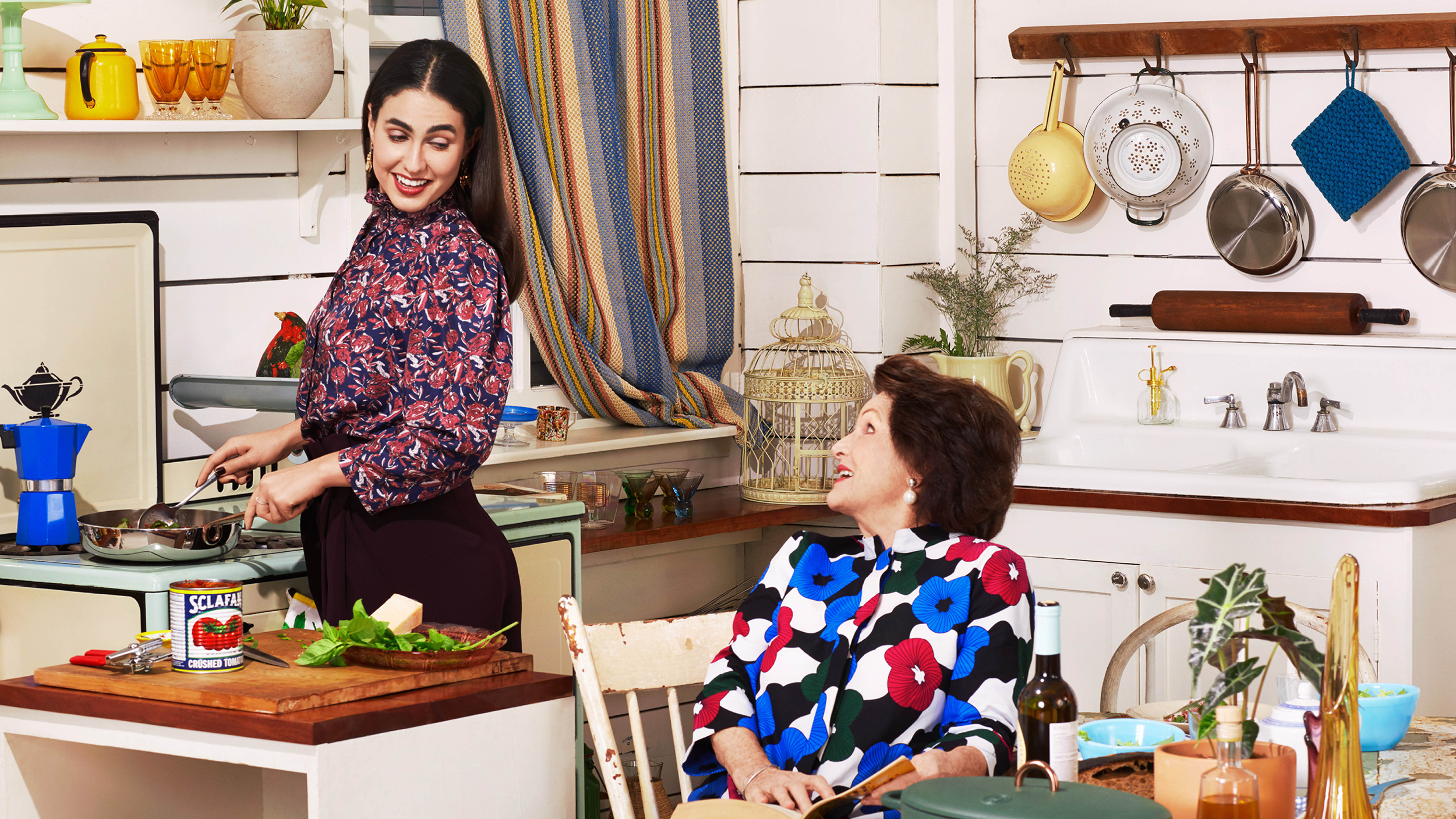
Great Jones is the kitchen company that wants to equip and empower people to cook more frequently with a line of stylish and affordable cookware, even if it’s just frying an egg.
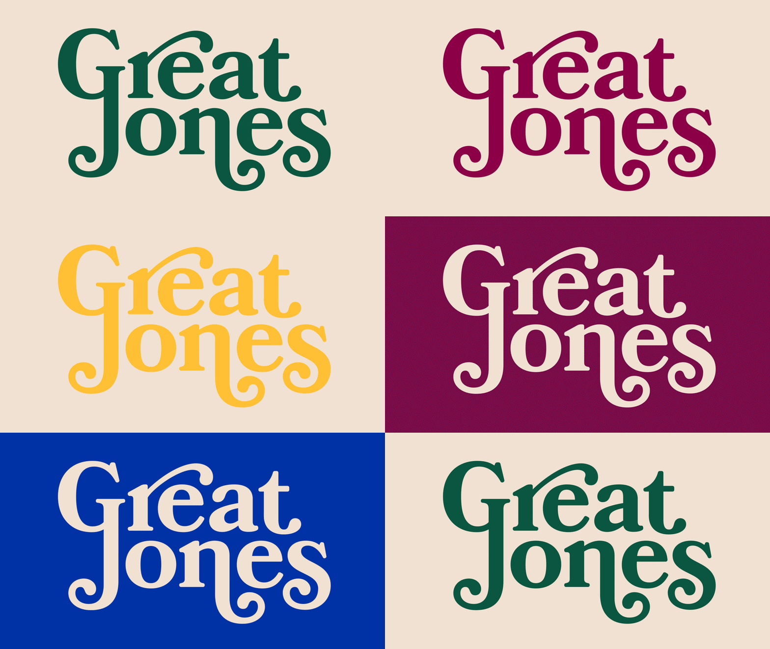
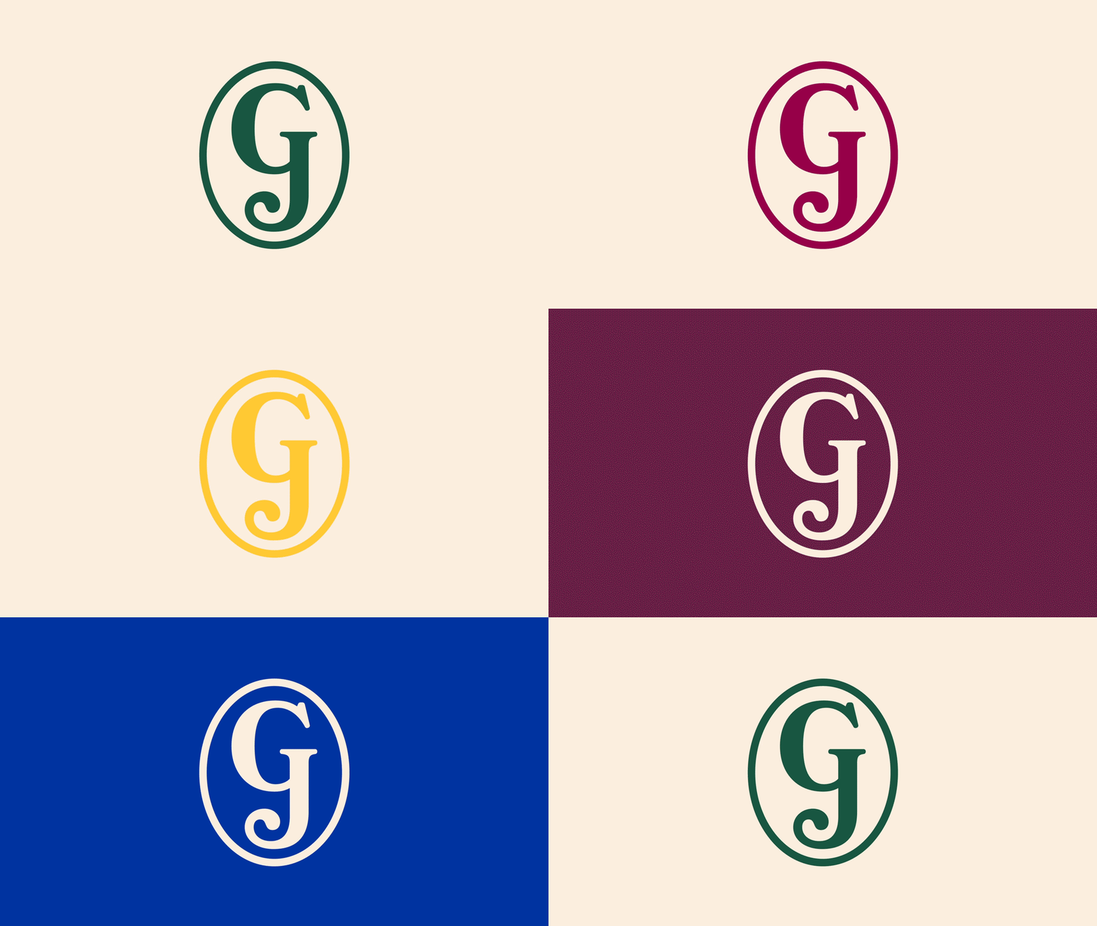
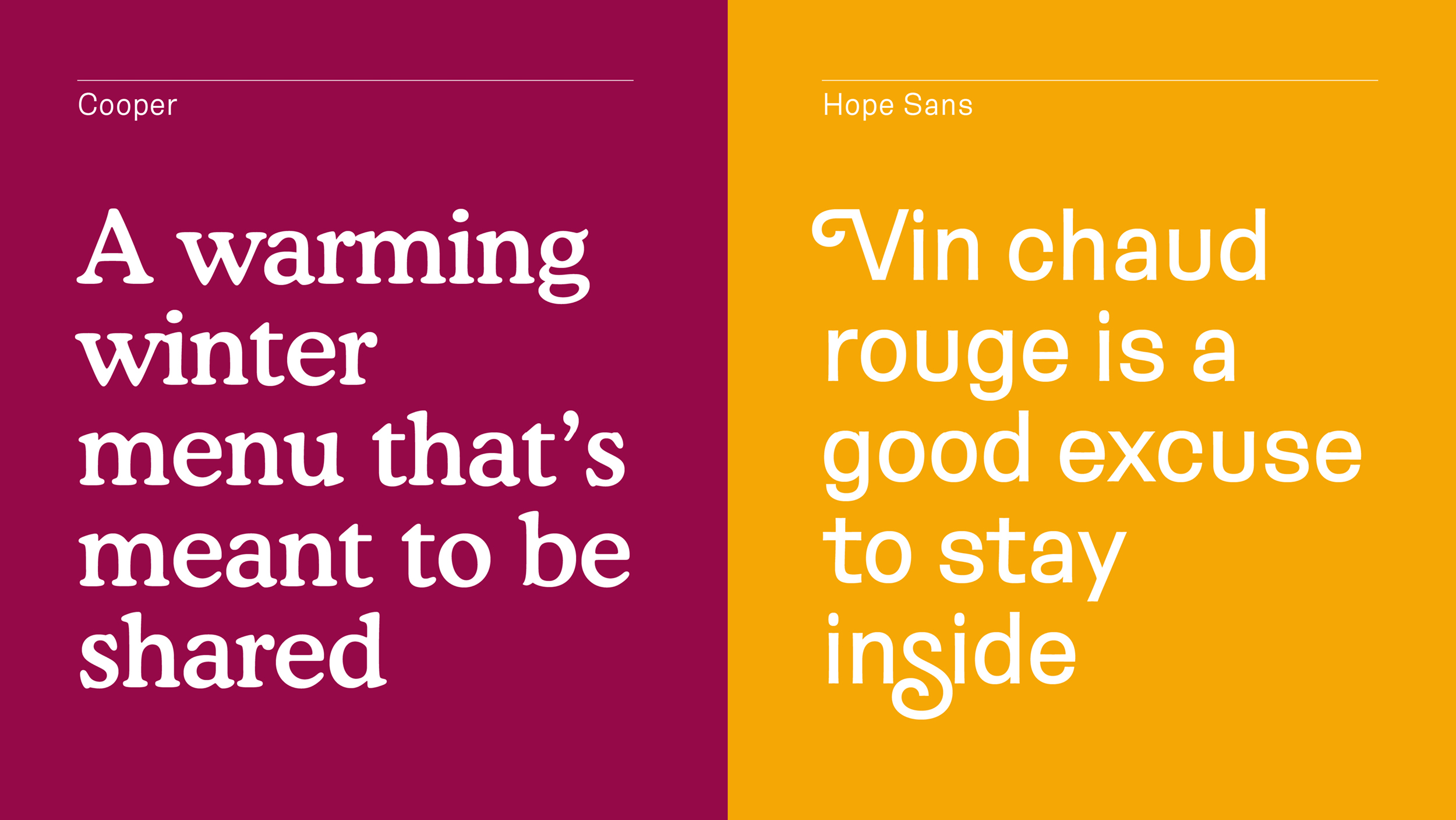
With my team at Pentagram we designed a brand identity for the company that captures the warmth and enjoyment of cooking.
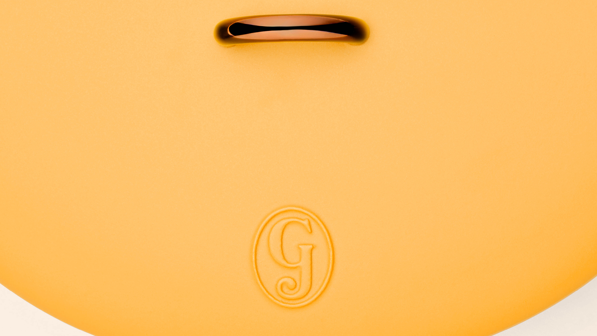
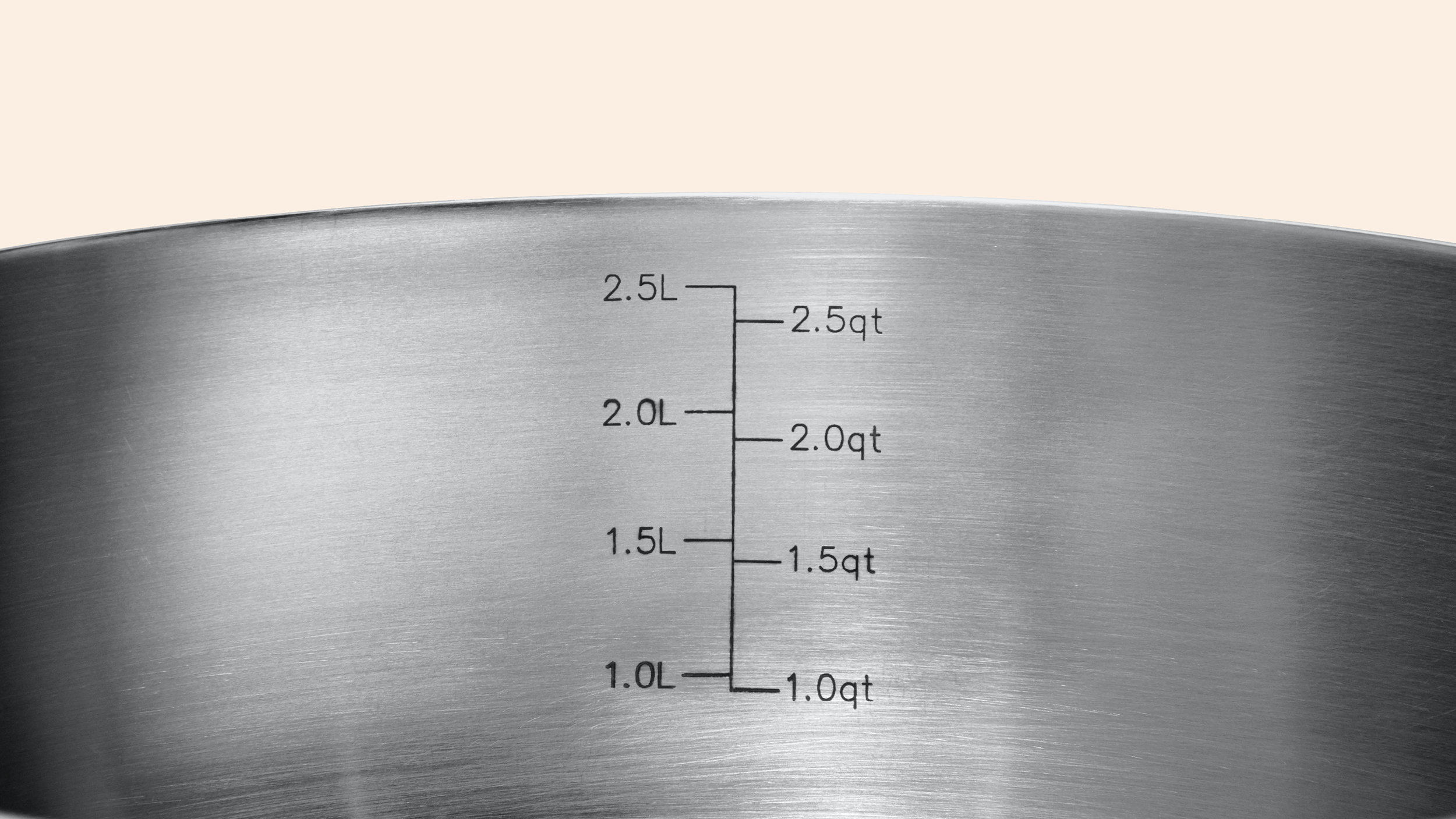
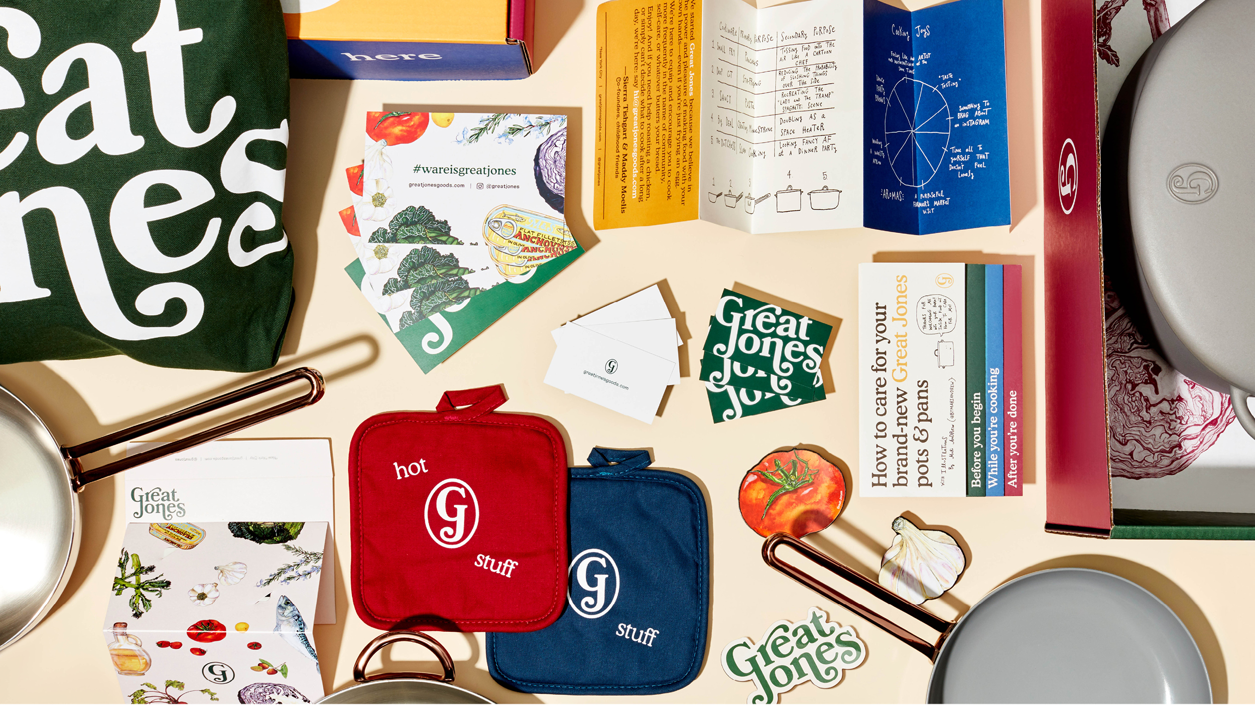
The soup-to-nuts project included consulting on the look of the pots and pans, product naming, colors, packaging design, website and promotional materials, messaging, photography art direction, illustration, and social media.
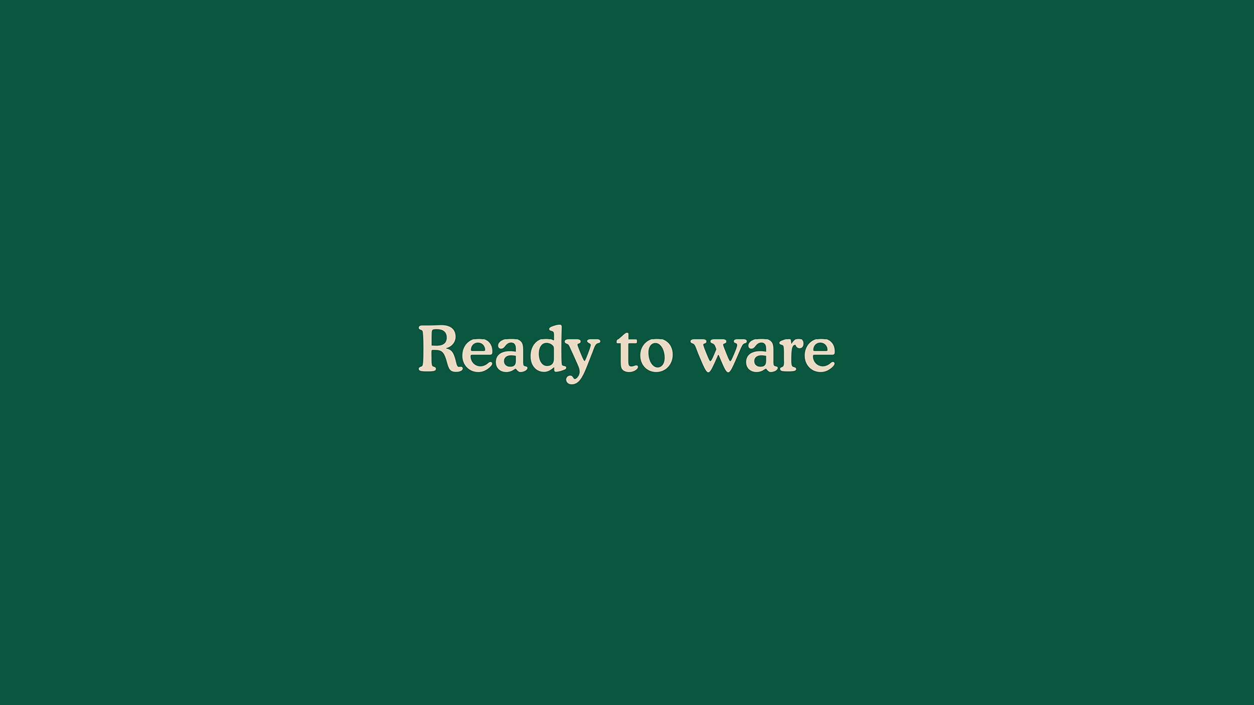
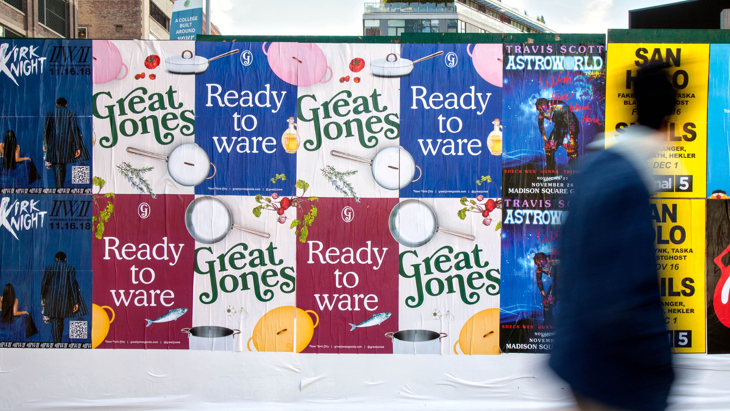
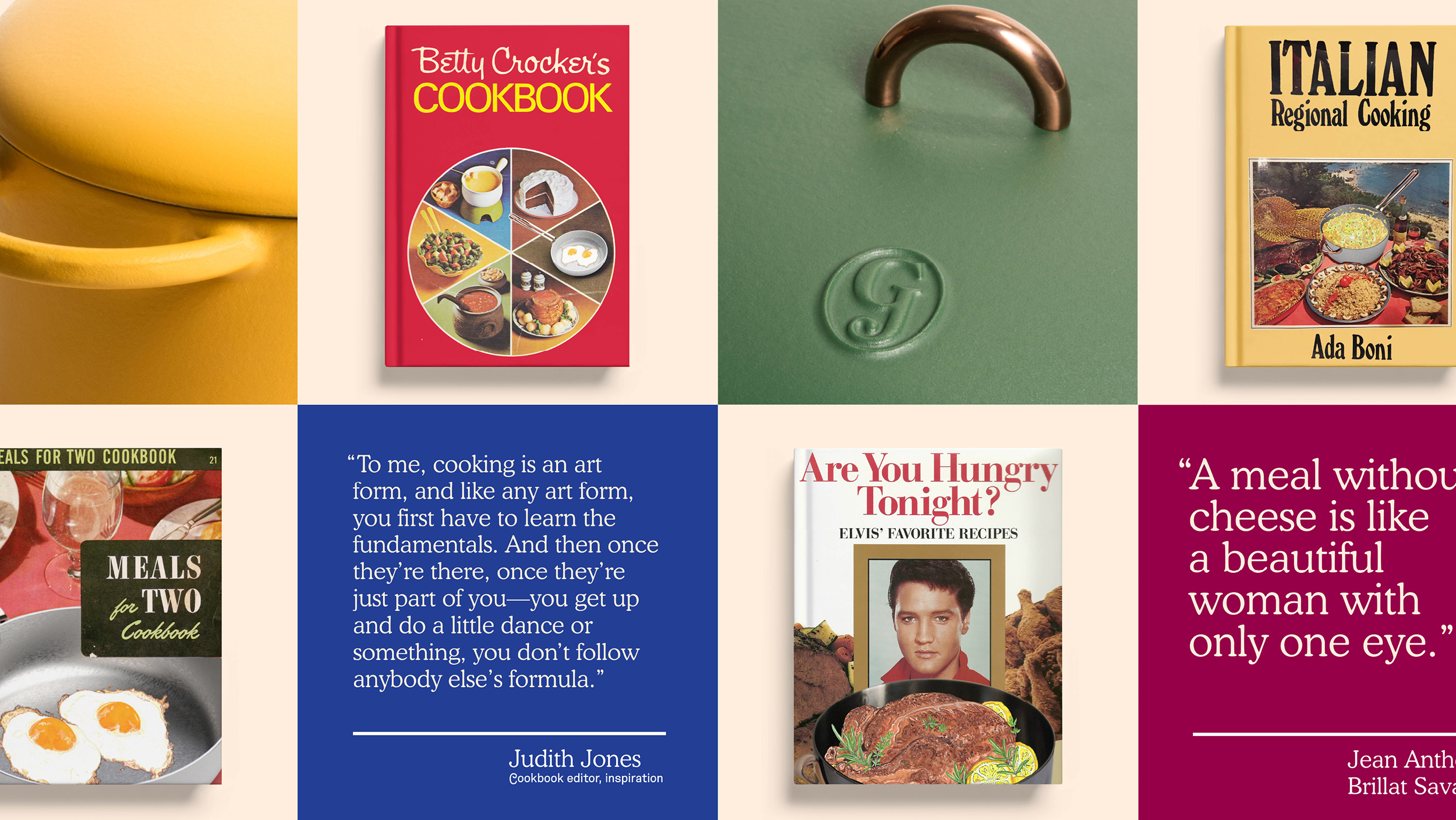
The distinctive name is a tribute to both the legendary cookbook author and editor Judith Jones, and the notorious Great Jones Street in Soho, New York City. The look is summed up in the tagline developed by the team as part of the messaging: “Ready to ware.”
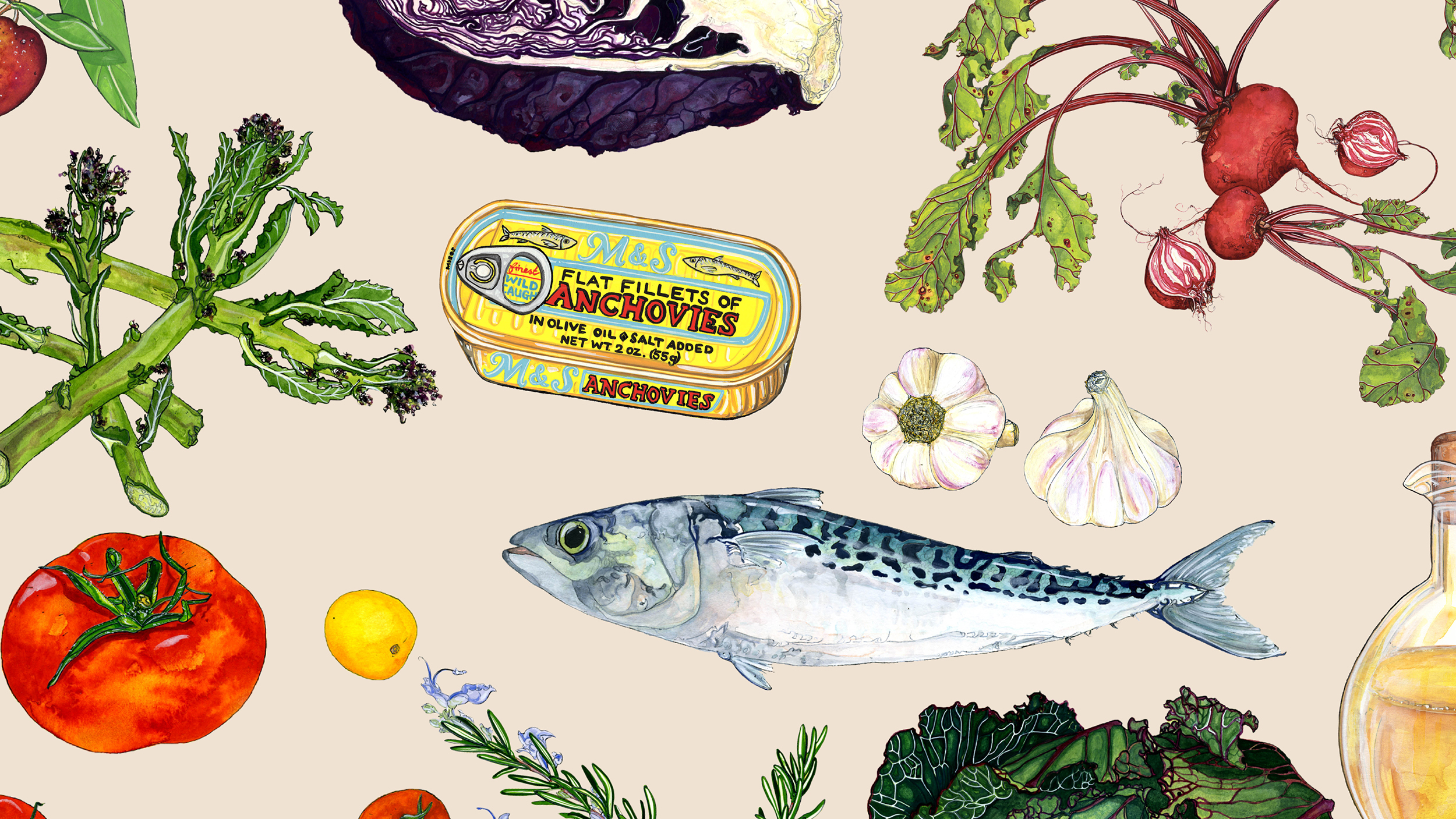
Great Jones cookware arrives in colorful, instantly recognizable packaging that stands out from other boxes on the stoop. The branding is complemented by watercolor illustrations of food by the London-based illustrator, Emma Dibben, whose rough, earthy style brings the natural ingredients to life. The color tab system extends to the Great Jones website, where it organizes sections and helps shoppers navigate. The company wanted its website to be not just an online store to buy the cookware, but also a fun place to linger, learn about cooking and become part of the Great Jones community. “Digest” is an editorial section built around the culture of cookbooks, including interviews with the “Great Ones,” celebrated chefs who share cooking tips and recipes from their own and others’ cookbooks.
Take a look at Great Jones’s website
Client: Great Jones Cookware
Agency: Pentagram
Areas of Focus: Branding, Graphic Design, Packaging, Art Direction, Web Design
Year: 2019
Creative Direction: Emily Oberman
Designer: Todd Goldstein, Laura Berglund
Project Management: Sarah Corey, Zoe Chrissos
Product Photos: Henry Hargreaves
Lifestyle Photos: Dan Kim
